Bizhut organization
Redesigning a website for an association dedicated to protecting the rights of individuals with disabilities, without altering the existing site content.
Type
Student Project with a Client
My Role
Member of a team of 3 UX/UI design students
Timeline
May- July 2023
Context
In our studies, we partnered with "Bizchut," Israel's primary organization for disability rights advocacy, to design a new website concept. Our design was selected to update and represent the organization's ongoing efforts in education, policy advocacy, and personal support for people with disabilities.
Challenge
During our initial review, we found that the current website did not align with the organization's recent updates. Our redesign focused on improving the site's functionality and aesthetic without changing the content. Key areas for enhancement included the home page, activity page, magazine, article page, and donation page to boost user access and engagement.

Problem statement
The existing website's overload of diverse, relevant information and varied user preferences posed a challenge in crafting a user-friendly design. Unclear about the organization's purpose and operations upon initial site access, we established clear objectives to guide the redesign process.

Setting Goals
The website redesign for "Bizhut" involved a streamlined four-step process, facilitated by group brainstorming sessions with the site's manager:
Restructing
Streamlined the site to improve donor engagement, family accessibility, and legal clarity.
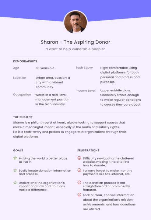
Personas
Analysis of site users helped tailor the design to their specific goals.
Branding
Developed a unified and appealing graphic style for the website.
Personas
I set my target into two groups: 1) Homeowners between the ages of 50 and 70, and 2) tenants between the ages of 20 and 35

Information Architecture
When we started researching the information on the site, it was important to us first of all to present all the existing information to us, both so that we understand the size of the site we are dealing with, and also to emphasize the areas we will touch on, since our goal is not to change the existing information but to be accessible in certain areas in a more convenient way for users.


Building the Structure
After building the pages and their content, we began the wireframing process. We started with the SIX-UP technique for the activities page, and after finding a structure that suited the website, we moved on to building the wireframes for the rest of the site’s screens.


Style Guide

Final Design

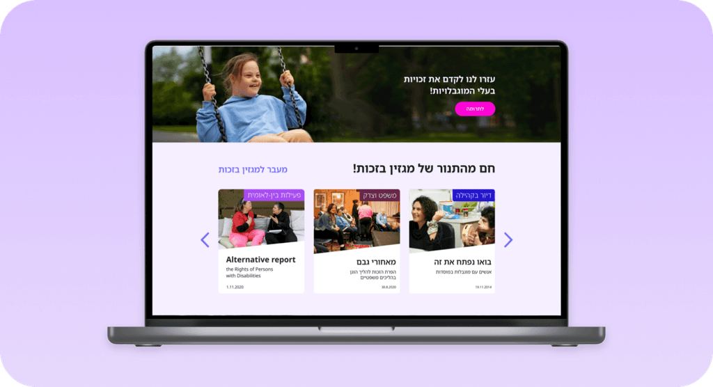
Home page & Activities page
We utilized clear icons and organized the content into a user-friendly layout to enhance navigation and understanding.

Activity page & Magazine
For the Activity page and Magazine, we aimed to provide a more modern design. The existing magazine lacked a search filter, making it easy to get lost among the articles and content. We introduced a new filter to improve accessibility and streamline the information presentation.

Article & Donation page
For the Article page, we crafted a more engaging layout that enhances the reading experience through the inclusion of images that aid storytelling and facilitate user comprehension. Additionally, the Donation page was revamped to meet modern standards, making it more visually appealing and user-friendly.
Takeaways
First Client Collaboration
Our project with the association marked our initial experience working directly with a client. We are thrilled that our project was selected from among others to redefine the website's design concept and even won a prize. This experience has been incredibly educational for us.
Branding Challenges
Early in the project, we quickly identified and began addressing branding issues that were initially very noticeable. Over time, we understood more significant concerns presented by the association, particularly that the website did not effectively communicate with potential clients.
Improved Methodology
We refined our work methodology significantly, especially in how we organized information. This adjustment helped us address the association's feedback more effectively.
Satisfactory Outcome
The final outcome was overall satisfying as we managed to resolve almost all the challenges presented by the association members, improving the website's functionality and user interaction.